This was my first ever commercial graphic design project, one that I had applied for on a whim and I am grateful for the experience I have gained.
I’ve learned how to work as a team and apply the design process to a real-life scenario, along with work experience for a company.
For about 3 months I worked on a rebranding project with a fellow student along with the guidance of the graphic designers from Stokes Street Studio. The client is a not-for-profit membership-based organisation that works to encourage young people to complete Year 12, formerly known as BMLLEN. According to the brief, the business as a whole desperately needed an update and had to embrace the traits: friendly, optimistic and credible.
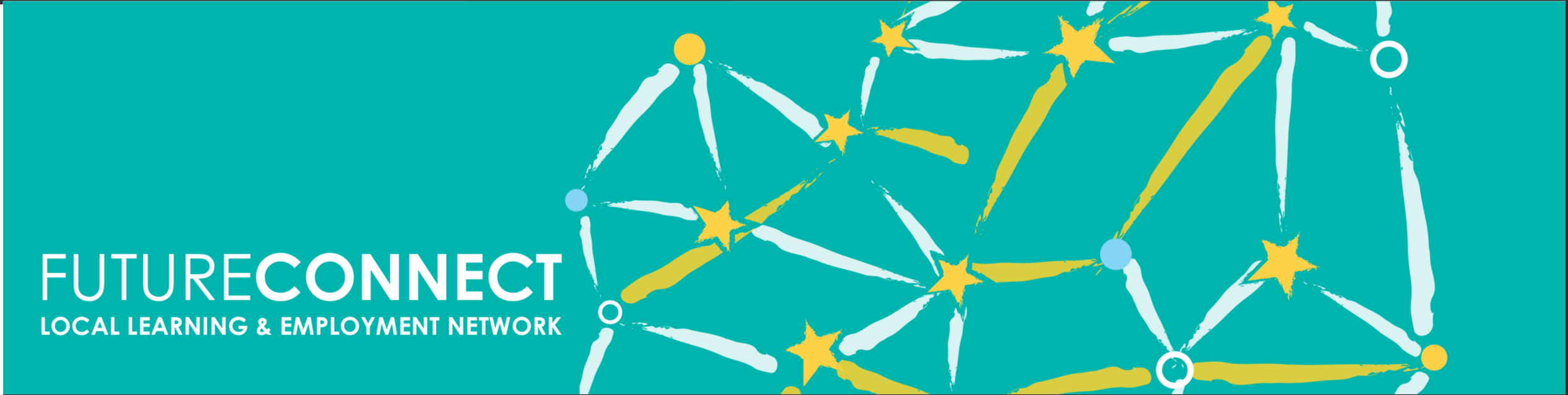
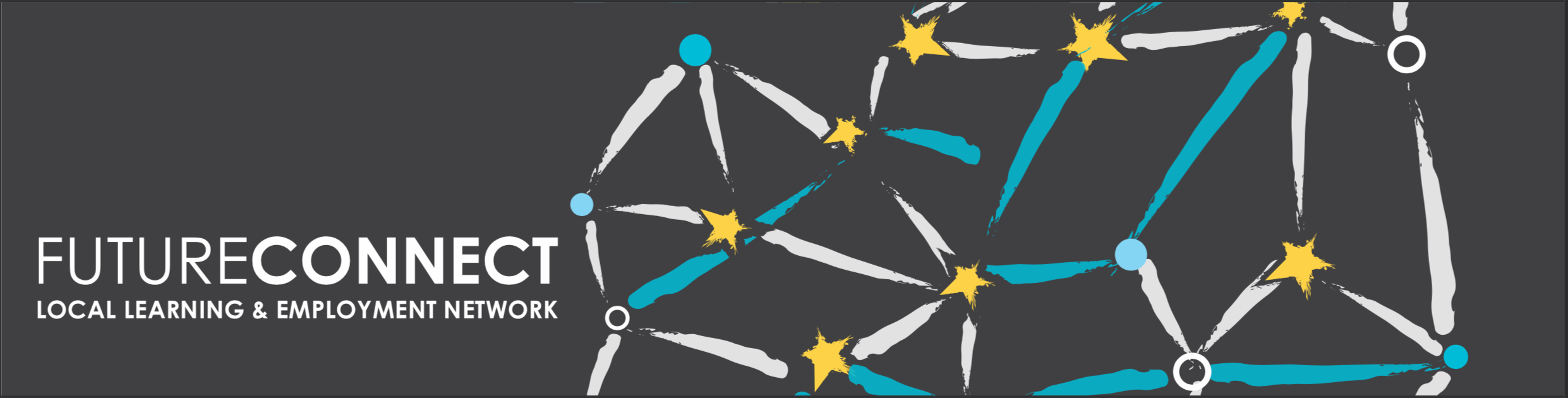
During the second phase: exploring concepts, we were also discussing a change in the name ‘BMLLEN’. After countless name suggestions, both the employees of BMLLEN and the board agreed to settle on ‘Future Connect’ as the new name.
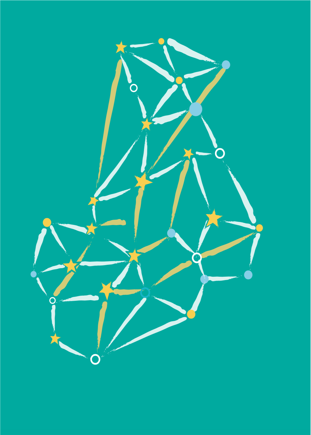
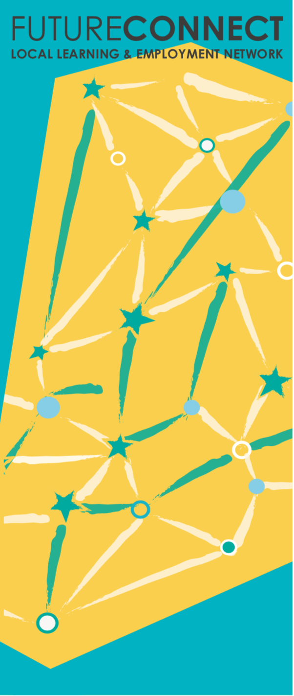
The third phase revolved around working up the chosen concepts: The first concept was to incorporate graffiti into the design as it represents the youth community through its liveliness with use of colour and meaning of being connected with one and another, which is exactly what BMLLEN wants to accomplish. The second concept was to basis the logo on a constellation or a pinpoint map, this was built upon the notion that BMLLEN wanted to become more connected to employers, schools, parents and young people. The third phase also includes experimenting with new concepts, we wanted to choose something that would resonate with the young people usually in high school in the western suburbs, which would give them and BMLLEN a common ground and example of this was the Westside hand sign.
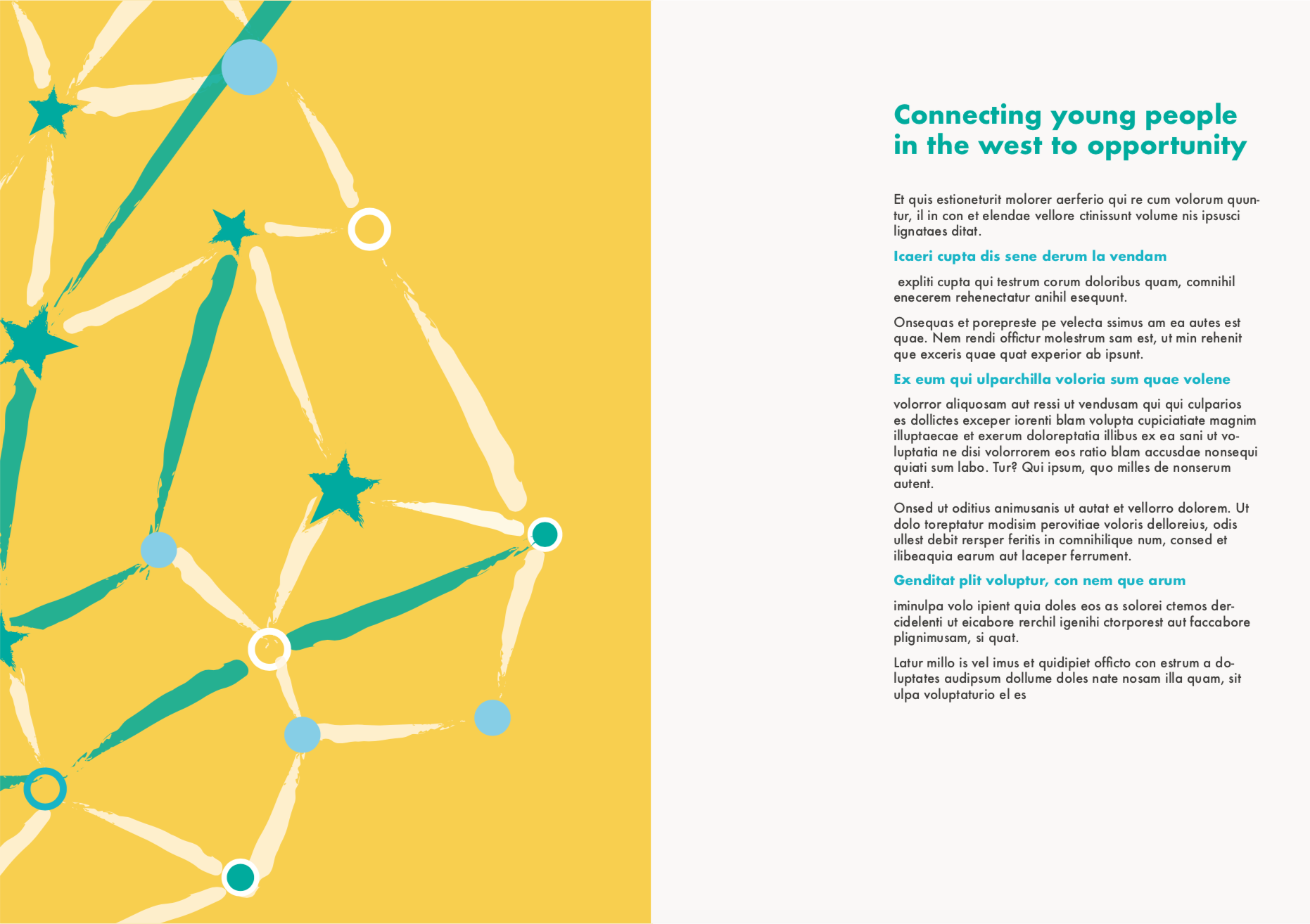
For the fourth phase, we developed the concepts by applying them to applications. This means we created different variations of possible designs for applications such as A4 Handbooks, Square Handbooks, and re-skinned Websites. After this, we presented our design process to the committee of management and from this, we received valuable feedback.
Choosing a final concept was definitely the most nerve-wracking experience, one because the due date was coming too close and two was the constant worry on who’s design would be chosen. To continue onto the fifth phase developing a style guide, they finally decided on the constellation version of the Westside Hand Sign along with the name ‘Future connect’ and ‘Local Learning & Employment Network’ as a tagline in century gothic (which was my concept). A style Guide is basically a branding rulebook that helps graphic designers, marketers, web developers, community managers, and product packaging departments all stay on the same page, and present a unified vision of the brand to the public.
The final phase is presenting the launch of the new brand to an audience that consisted of members of the committee of management, employers, teachers, and parents.
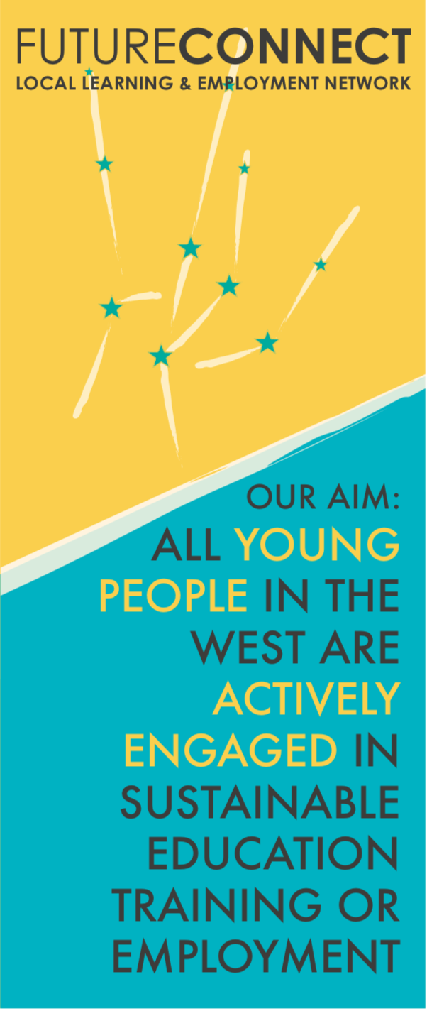
The launch was streamed live on Facebook and there also was a media release about the new brand. Below are images of design applications for the new brand ‘Future Connect’ applications, taking from the style guide.
Click to view a video of everyone who was involved in being “interviewed”. For privacy reasons you may need the password to watch the video: Sleepyredpanda
Click to view the post I have created for this project.